Wednesday, 16 March 2011

Thriller Opening Titles - By Ghislaine

1. Wallander:

  • This is the opening title sequence they use for every episode (1.38 - 2.09).
  • It uses the colours black, yellow and blue, this might be because 'Wallander' is Swedish and the Swedish flag is blue and yellow.
  • Also the background is yellow (bright and eye catching) with black writing, so that you can easily read the text.
  • The yellow background also spells out WALLANDER (which is the name of the TV Programme).

  • The soundtrack which plays throughout that sequence sounds deep, depressing and meaningful.
  • The lyrics also say 'my knuckles bleed', which could mean that someone has been in a fight, or done something to hurt themselves.
  • That links to how Wallander is a thriller/crime, because you have to sacrifice yourself and others to do their job.

2.The Terminator:

  • This is the opening title sequence for The Terminator.
  • It uses blue, white and green writing. The blue writing in the background, also like in Wallander, spells out The Terminator.
  • The white writing are the actual titles, and the green is used after every sentence, to make it look like it is typed and that it has been accepted into the computer.
  • The writing has been made to look like it is typing whilst the audience is watching it.
  • We where thinking of doing that for our first idea, because we though it would look creepy, and weird that it is being typed when the audience is watching, because they can't see the source of the typing.
  • The soundtrack that plays throughout that sequence doesn't have any singing, just some instruments.
  • The noises i can hear are lots of different pitches of drums and a high pitch clanging noise.

3.Buried:
This is the link to the opening sequence:
http://www.artofthetitle.com/2010/10/25/buried/

  • This is the opening title sequence to Buried.
  • It uses different shades of brown for the background, and it uses blue and white for the writing.
  • They have chosen this colour for the background because they are earthy and muddy colours. And they have used the colours for the writing so that we can easily read it.
  • The browns make it look like you are underground, however the blue also represents the sky, so it could also mean something different to underground, maybe above ground.
  • The writing and different shapes move upwards, however, they are not meant to be moving upwards, you are sinking.
  • This links with the title 'Buried', and so the background is meant to be the mud and earth around you, and the writing is making it seem as if the viewer is sinking further and further into the ground.
  • The soundtrack that plays throughout is very deep, and makes you feel tense and worried about what is going to happen next.
  • The soundtrack sounds like an orchestra, with many different instruments, such as drums, violin, flute, trombone, saxophone etc.


Friday, 11 March 2011

title research-Amy beckwith

through looking through "the art of the title" website we have found lots of different types of titles that
have inspired us for our film.

Juno


The opening to Juno  is known for its artistic cartoony title, what i really like about this one is that the title opening is animated but still follows on the story. we can use this type of thing for our opening as it is quite child like and our film is about a child. But this type of opening does not fit out titles as the theme of our film is quite dark and mysterious and this type of title is too happy and cheery for what we need. 


Cheri  

http://www.artofthetitle.com/2009/07/02/cheri/

 The opening to Cheri is very ornate and classic looking what i really like about this is the scrap book idea this title has i think we could use a title like this for our film because our film has a very family orientated feel to it and we could do a montage of photos of her and her mother and the final picture could be the picture she painted ripped in half  with her on her own. 

My idea taken from research 

this is my idea for the title of our film, i took most inspiration from the Cheri title by using the picture ideas and the idea of the ripped painting is good because it looks like shes been ripped away from her mum. And the wobbly childrens text is eerie and connects with the story. 

Other titles could be just the childrens text super imposed over the film as it plays this way we wont have to add another 30 seconds more of film onto our opening creating a separate title part. 

Research on Title Sequences By Beth


  • We have been researching different types of title sequences showing step by step anamation for an idea for our title sequence. We have come up with this idea of linking the anamation to the title of our thriller which will be called 'Alone'. The line will come up and form the letter 'L' which will then carry being made into a tree, almost as if it'd been painted.

  • This screen grab shows the part in the opening sequence from "catch me if you can" that we were looking at as an idea to do for our title sequence. As you can see from the video below this part is when the line forms into the main title of the film. Which we were inspired by because it's a different way of showing the title of the film.

  • While we were researching different title sequences we found one from the film "Catch me if you can" which had various parts that we would like to experiment with as an idea for our title seqeunce.

Font chosen- Amy

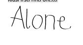
we have decided by looking on font websites that the font 'kids firstprint' is the best type of font to use for our titles as it looks like childs writing and fits the theme of our opening.

we can download this font from here: http://www.dafont.com/kids-first-print-fo.font?text=Alone&fpp=50

and the film title would look like this:
but we also want the picture in the film in the corner of all the titles but on the last one "Alone" will only have the picture of the girl with no mum.

Thursday, 10 March 2011

Research for our Title and credits font - By Hannah

  • As we have finished filming (for the second time and hopefully the last!) we are now starting our editing and need to think about how we are going to present our title and credit sequence as it's the opening of the film.


  • I have conducted my own researched into different fonts and these few I already had on my computer. However, they fonts that need to be downloaded from websites such as www.Dafont.com . Hopefully they will be able to be used on the software we use to edit our movie.


  • We also haven't thought of a title yet but came up with some suggestions when filming.

  • This font is called 'Sunshine in my Soul' and looks like someone's handwriting and could be seen as our characters handwriting.
  • This font is called 'LeviMarker' and looks more like someones handwriting. However, it is quite bold for handwriting so it may seem a bit unrealistic.


  •  This font is called 'HW Marbo BD' and again looks like handwriting. However, it is quite neat and professional which isn't what our young girls handwriting would be thought of being.


  • This font is called 'FFF tusj bold' and looks like drawings. This could be good for our font as we know our character paints and draws and so could connect to that.

Friday, 4 March 2011

Location Ideas and props- A

Location of our new idea


This is the childcare corridor in college which we may use for the painting scene. However, if our character appears here then it will have no connection with a memory of hers of her past and also look out of place with the other scenes. 
We will use this if we are not able to use our other location which is Amys Nan's house as it look traditional and more in sync with the other scenes and story line.
 we also want to use one of the local parks in the area that have swings, the best parks for this is either Victoria park or Northlands wood park which would be the perfect setting.


Costume and props

little girls costume

the little girl in our film is a typical traditional concept of a middle class little girl. This is why we have chosen for our child to wear very girlie pink dresses and accessories. 

the sort of look we want for our character is this: 
from the costume you automatically think the girl is sweet and innocent and wouldn't hurt a fly this is the sort of assumption we put across in our media film to make the audience feel sympathy for such a innocent character.

Mothers costume 

The idea we want to put across for our mother character is that she is a middle class modern working mother. We wanted to do this to show that her death may have happened because of her job, for example she may have worked as a spy or for example  high up in a company with a lot of enemy's.
the look shown hear shows wealth and is very "smart casual" showing her work side coming though into her personal life. It also shows pride and worry about self image by always looking smart.